Kotak811: The Story Behind Our Refreshed Look
A new brand identity for a new vision, designed for digital India
Every once in a while comes a wave of innovation that has the potential to become a revolution. Paving the way for innovation in digital banking is Kotak811. Delivering a personalized, easy and unified approach, Kotak811 is a one-stop digital solution for all your banking needs. We bring you one of the most seamless digital banking experiences, packaged in an all-new look.
With Kotak 811, ease and speed are at your fingertips. Version 2.0 of our logo is all about creating an identity that is relatable, reliable, and approachable. We are a neo-bank, incubated by Kotak Mahindra bank - a new-age digital bank, with the same principles. Our mission is to deliver a world-class and trustworthy banking experience for a new, digitalized India.
Inspired by Change, Committed to Innovate
On the 8th of November 2016, the Indian Government announced a historic move - demonetization. The Indian economy witnessed an overnight landmark change in how people transact. This very change served as a call to action to adopt all things ‘digital’. We acknowledged this shift, welcomed it, and chose to play our role in transforming traditional banking experiences. Our answer: Kotak811 - symbolic of 08/11. We were built on the idea to help India adapt, evolve, and eventually overcome the barrier of digital banking.
A Logo Where Every Element Speaks
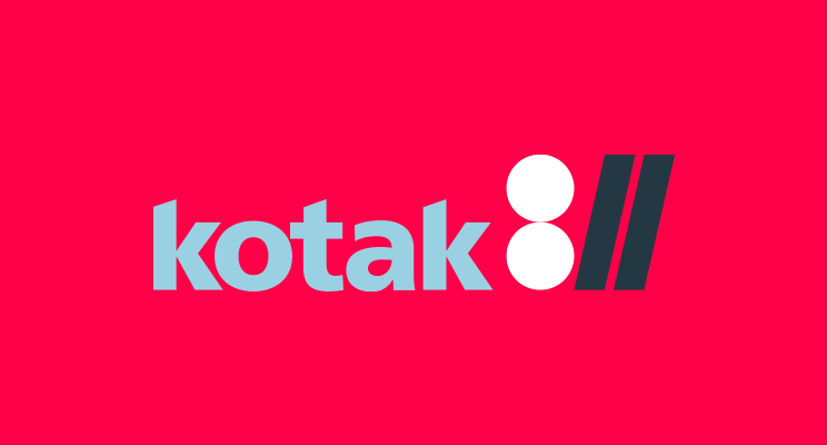
Kotak811 is a digital online bank - quite literally, a bank in your phone. We are dedicated to democratizing banking, powered by technology. This makes the internet our biggest advantage. On the internet, a URL is an essential element to using and finding anything, and it begins with the forward slash. It also stands for a link, something that enables access. Incorporating '//' into our logo was a seamless fit. As opposed to upright 1s, this tilted variety brings comfort and ease to the overall unit of Kotak811. The slashes tilted forward signify growth, and our aim is to be recognized as the go-to place for neo banking. This new persona has been designed by the New Delhi-based creative agency, Animal.
Banking Beyond Barriers
While Kotak811 represents qualities of equality and inclusiveness, the logo accurately represents our principles of ease and convenience. It perfectly marries new-age banking experiences with our legacy of trust.
As the focus shifts from cash to digital, the implications for the banking industry are significant. Our aim is to take the promise of inclusion beyond the product and get people to experience and participate in a movement that works towards a more integrated society. We look to have an impact on all strata of society, empowering them with access to secure online banking. As we look to the future, we strive to be leaders, revolutionizing this new era of banking.
Payment and lending for EVs
2yHope new logo gives you new drive
Dabbling in Pixels, Code, and Everything In Between | Design Maverick at Unbxd
2yno!! please no, I get that you are trying to minimalize the logo but this shouldn't mean to dummify it. All the colours are less saturated. And the logo look likes a code " :// ". The purpose of the new banks or as we call them neo banks should be to get more close to people in a more humanly way, not in a tech-savvy way.
Co-founder @ MProfit, Tech Advisor
2yThankfully, demonetization did not happen on 9th Nov.
MD & CEO - Aavas Financiers Ltd
2ySuper. All the best.